Introducing The Correlation Cone, a New Way to Visualise Your Risk
I’ve been working at Financial Canvas now for nearly two years and am having great fun learning about risk modelling and software development using a range of analytic and web-based programming languages to carry out calculations and bring the analysis to life.
We help our clients to calculate and visualise their investment and actuarial risks, and I’m excited to share a new way of doing that, which we are calling “the Correlation Cone”.
Contribution to risk and marginal contribution to risk are often used with waterfall charts to understand the sources of risk in a portfolio. This is neat (and very much part of our toolset) but it can get cumbersome with lots of groupings / components. Our founder Chris was discussing this with at a meeting with one of clients, Marc Devereux, who heads up the investment consulting practice at Broadstone. Inspired by the need for a more comprehensive and visually impactful tool, and (as always) armed with his marker pens, they sketched up the Correlation Cone in an effort to create a more visually striking and informative graphic…

Back in the office we coded this up as a sequence of absolute and marginal contributions to risk. First: what is “my” risk. And then: how much risk does this add to my grouping?
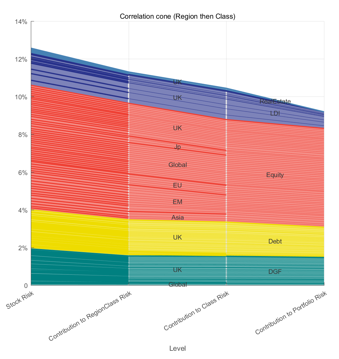
Moving from the left side to the right, this chart accumulates and stacks up risk, starting from individual asset classes, progressing through subclasses, and culminating in the overall portfolio. It's a journey that illuminates how each element contributes to the broader risk landscape. Unlike traditional charts that might focus on one aspect, the Correlation Cone provides a holistic view to answer questions like:
how much risk does this fund have?
how does it affect the regional asset class risk?
how do regional asset class risks contribute to the asset class risk?
how do the asset class risks contribute to the portfolio risk?
At each stage you can see the contribution of the individual funds!
Like all Financial Canvas tools the models and dynamic are interactive so you can see how different strategies behave and understand how the underlying assumptions affect the picture.
In this example, we have used regional asset classes as a stepping stone so that we can see how funds from around the world contribute risk individually and at sub-fund and asset class level. Other groupings can be possible. For example, you might prefer to group by asset sub-class first and build up the picture that way.
Curious about using the Correlation Cone as part of your investment advice / decision making? Drop us a line in the comments to let us know what you think!