INTERNING AT FINANCIAL CANVAS AND OUR NEW CORRELATION CHARTS!!

Hello World! This is Oscar Squirrell and Sam Twite with our first blog working for Financial Canvas. We are both A-Level students working at Financial Canvas over the summer seeing how our maths and, respectively, economics and computer science is applied in the real world…
Our broad task was to familiarise ourselves with the Financial Canvas economic scenario generator toolset and then add some new charts to provide users with more insight into the correlation of the projected returns.
During our time here, we analysed economic simulations to help answer a client question about the correlation of different financial assets. Typically, you might see a single correlation table to describe the output for such a model but, looking deeper, we found that correlation between assets varied widely across different simulations providing a deeper insight into the behaviour of the model.
Read below to see how we extended the tools and generated new charts to provide additional insights… These new tools are now part of Financial Canvas so it’s cool to think that our work will help lots of clients to better understand their economic models! Please get in touch if you’d like this analysis for your economic simulations 😊
Background
What is an economic scenario generator? (And what do the series look like?)
The idea is to create simulations which capture how the user thinks that the world might behave in the future to help understand how a portfolio of assets might behave. It helps to answer questions such as: What is the expected return of my portfolio? How risky is it?


Each simulation should present a coherent view of how all the assets will behave. It’s not enough to create believable simulations for each asset class, we want to know how they move relative to each other as well. For example, UK and US equities tend to go up and down together (but not always). A useful model captures the user’s views about this behaviour, which can in turn help them to understand risks and test different portfolio ideas.
“If the model captures my views, then I can use it to help me understand risks and test different portfolio ideas”.
Financial Canvas has charts for measuring the correlation of the returns of different assets at any given time point. This is measuring the correlation of returns by simulation. i.e., in simulations where UK equities go up, do US equities tend to go up too?

We loved this chart showing the pairwise returns; the shape of the ellipse and colour provide visual insight into the relationship between returns of different series.
And looking at the whole model…(!)

BUT there is something odd about measuring correlation by simulation i.e., “cross-sectionally”. When we look back over time (to form our views), we are measuring correlations through time i.e., “longitudinally”. Could we better test whether the model matches our views by looking at correlation of simulations through time?
Our challenge was to add calculations and charts to measure the longitudinal correlations for all the simulations. And this comes with a twist! We have 2,000 simulated future paths which will give us 2,000 longitudinal correlations for each pair of assets. Looking through this lens we will see how different simulation paths exhibit different correlations!
Will this be uniform (i.e., with all paths exhibiting similar correlations) or will different paths have different correlations?
Getting started
We started out by familiarising ourselves with Financial Canvas and played around with various graphs which outputted the correlation cross-sectionally (at a selected point in time). We then delved deeper and went through the code getting a broader understanding of how the value for correlation was generated. We saw there were two methods of calculating correlation in use, Pearson and Spearman. After some further research into these, we had gained an understanding about what they were, how they were calculated and when each should be used, which proved useful later in our time here.
After our preliminary use of the analysis tool, we felt ready to tackle the main problem we had been set.
Adding our code!
The dataset is a 3D set of returns: 2000 simulation x 200 asset class x 20 time
Chris was keen that we generalised the problem into an observation dimension (do we measure correlation across time or across simulation), the asset class dimension, and then the residual dimension would show how correlation varied (e.g., by simulation or by time).
At first this sounded daunting but after stepping into the code and making use of some of the easy-to-use functions already in place we manged to create a stack of correlation tables, which we called correlation “towers”.
With simulation as the observation dimension, we get a stack across time:

And with time as the observation dimension, we get a stack across simulation:

Next up was working out how to visualise this new data to see if it held any new insights into the behaviour of the model!
We approached this by asking questions and then devising suitable statistics and charts to answer them. With Financial Canvas it is really easy to add new charts that will be available to all users.
Q1. Is the cross-sectional correlation stable through time?
Now that we could request a correlation tower of shape asset class x asset class x time we added a chart to show how the existing pairwise correlations by simulation varied through time:

This is the first new insight: our chart showed a marked increase in the correlation value after the first year of measurement. This is curious that the model “takes two time periods to reach a steady-state”. Is this intentional? Or even known to the users of this model?!
Q2. Is the cross-sectional correlation consistent with the longitudinal correlation?
Our next step was to see whether our new calculation was consistent with the existing calculation approach. There were lots of numbers involved here, so we started by looking at the “average behaviour”.
We added a table showing the Median (across the simulations) of the Correlation measured across Time.

Existing table showing the cross-sectional correlation.

We used the “Get Data” button to copy the data into excel to compare the outputs for all the series.
Accounting for the one year “building up” above, we decided to output two tables to compare with our correlation across time: one measuring correlation in the first year and the other measuring correlation in the tenth year.
This led to output of the following tables. Due to the size of the data, we created a colour map to see the differences in the values of the data: with dark green showing a high positive difference, yellow showing a small difference and red showing a high negative difference.

The tables highlight that there was a far greater disparity between Time Series Correlation Return and Median Correlation Across Time in the first year of measurement than there was in the tenth year.
This was still a lot to take in! We decided to simplify it further by creating a table with the minimum, maximum and average values to look at the overall behaviour.

Overall, we felt that the existing measure of correlation (across simulations) provided a pretty good estimate of the average correlation\ in the model across time.
Q3. Does the longitudinal correlation vary for different simulations?
With our new longitudinal correlation calculation, we were able to look behind the averages and see the distribution of these correlation values across the 2,000 simulations.
We chose the histogram chart setting the x-axis bounds from -1 to 1 to frame the results between the negative and positive boundaries.
Firstly, we looked at asset classes with high correlation. This histogram shows the distribution of correlation between US equity and UK equity, which had a median longitudinal correlation of 75.34%. Despite this high correlation, the histogram highlights that some simulations were uncorrelated. Most are pretty close to expected though:

Next, we looked at the distribution of correlation between US equity and UK Direct Property which have a lower average correlation. This chart showed the correlation varying from -60% to 75% in different simulations. Completely different behaviour!
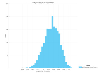
We don’t know whether this is a good or bad feature of the model, but it is certainly very interesting and probably important to understand if you are using the model?
Insights into the model
We learnt a lot during our time at Financial Canvas being introduced to new skills and concepts.
We were also able to tackle the task that had been set for us, and we had several interesting findings for our sample simulation set, including:
the cross-sectional correlations were systematically lower in the first time-period and stable thereafter
the stable Cross-Sectional Correlations matched pretty closely with our Median Correlation Measured Across Time, but
the Longitudinal Correlation varied significantly for different simulations.
We hope that Financial Canvas users find our new charts useful 😊
Further research
If we were to get another opportunity to work with Financial Canvas, it would be great to use Financial Canvas’ historic timeseries toolset to investigate how these asset classes have actually behaved in the past. We could compare the past data to the future simulations produced by the model to help decide whether the big variation in the correlations that we noted above was realistic or not.
Working with Financial Canvas was a blast and we even got to try the coveted ginger tea! Thanks to the team for having us and we hope to be back to look at more questions with Chris and the team.